Are you tired of looking at the same old bedroom furniture and outdated decor? That’s how I felt about my primary bedroom. It hadn’t been updated in over a decade, but moving the heavy furniture out of the room was daunting. However, with a little push from my sister and collaborator, Iesha Williams from The Uncluttered Lifestyle, I decided it was time for a change.
I wanted to transform my bedroom from basic to moody, cozy, and relaxing, with a monochromatic look that felt light and airy. I decided to keep all of my existing furniture and decor, which would save me money. Plus, I had invested in quality pieces that were timeless.
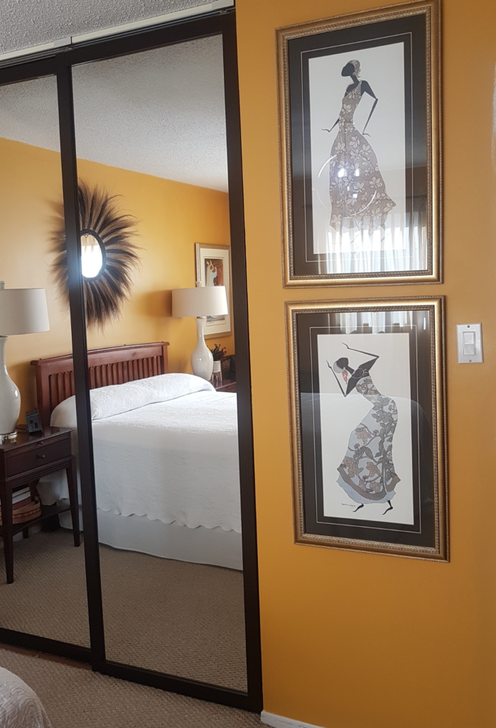
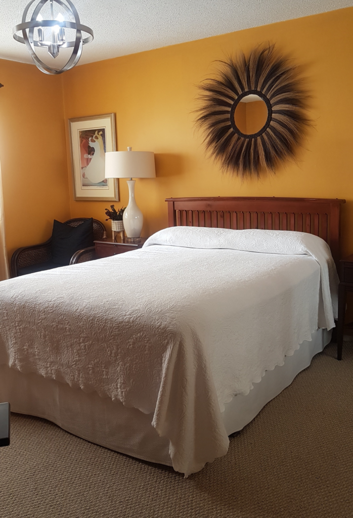
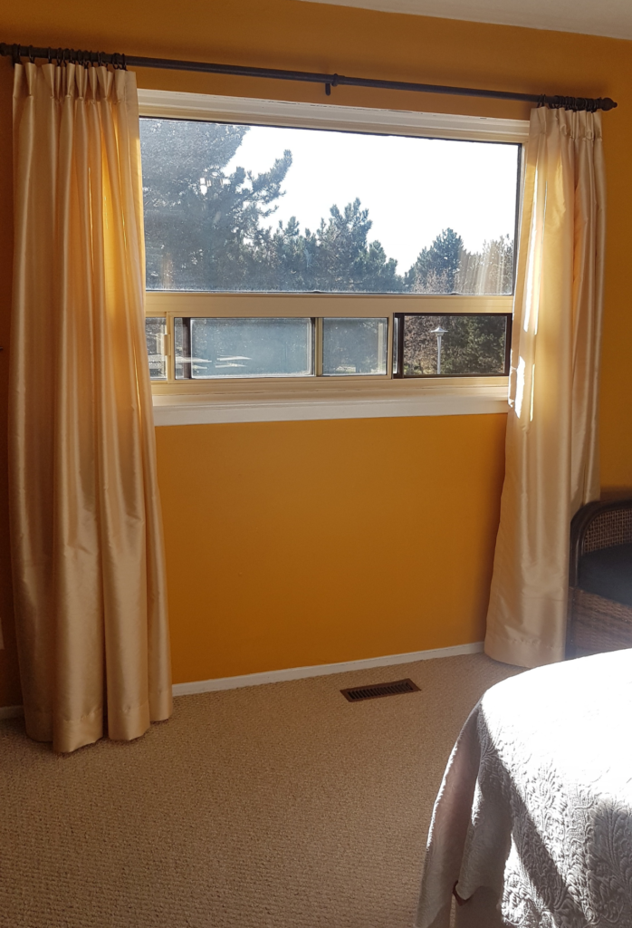
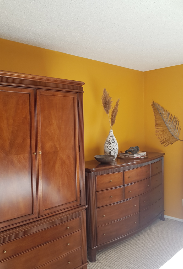
A Look Back
My plan included changing the paint, adding new window treatments, lighting, bedding, and creating a feature wall with picture frame moulding. I wanted natural, earthy colours and textures combined with a bold statement wall.
What I’m Visualizing
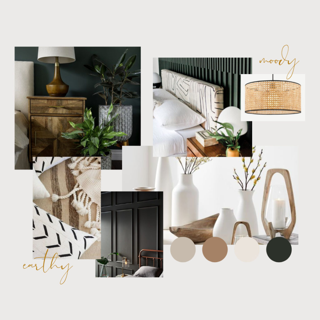
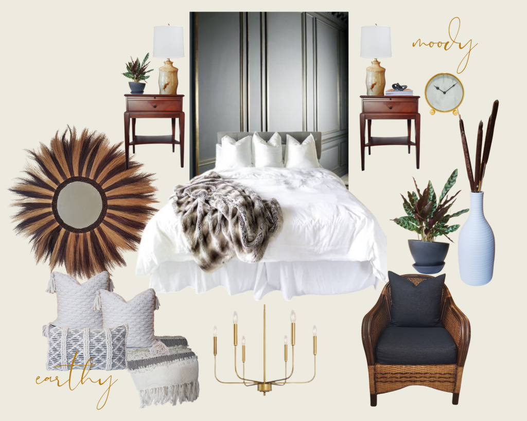
To help me visualize the final look, I created a mood board that incorporated natural, earthy colours and textures combined with a bold statement wall.
The Colour Palette
Selecting the paint colour for my primary bedroom was the most enjoyable phase of the project. There are countless options for “white” and “black” paint colours to choose from, and as someone who previously used Sherwin Williams for the exterior of my home, I decided to stick with it.
As a fan of Iesha’s breezy coastal Cali vibe, I inquired about the “white” paint color she used for her primary bedroom walls. She recommended Sherwin Williams’ Alabaster, which I found to be the ideal choice due to its warm beige undertones that perfectly complemented my decorative accents.
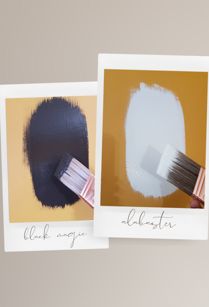
Once the primary bedroom’s colour scheme was established, my next task was to find a “black” hue with warm undertones that complemented Alabaster. It may come as a surprise, but black shades can possess warm undertones similar to white paints. Thankfully, Sherwin Williams’ sales representative came to the rescue by suggesting Black Magic as the ideal hue for our accent wall, streamlining the paint selection procedure.
Popcorn Ceiling Removal

Prior to painting, we had to address the unsightly popcorn ceiling. While it was a messy and dusty process, the final outcome made it all worthwhile. However, it’s important to note that using the appropriate dust mask is crucial. Learn from my mistake and avoid using a simple face mask – trust me, it doesn’t cut it! 😛
Picture Frame Moulding Feature Wall
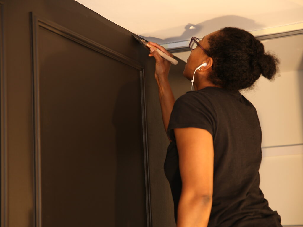
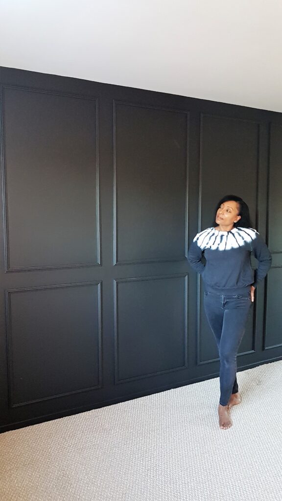
The addition of picture frame moulding on the accent wall was the true game-changer, resulting in a stunning transformation that elevated the space with added depth and sophistication. Regrettably, I didn’t provide a tutorial in this post, but there are more walls to cover, and I promise to share a step-by-step guide in a future post. Stay tuned! 🙂
Even without furniture, the room feels like a cozy haven. To ensure a smooth finish, I applied a primer before painting, even with a dark colour like black. This step is crucial in preventing any yellowing from showing through over time. Check out the video for a glimpse of the installation.
The Thrill of a Good Thrift
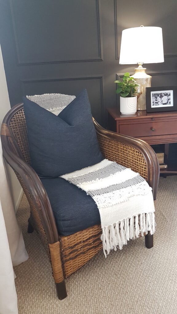
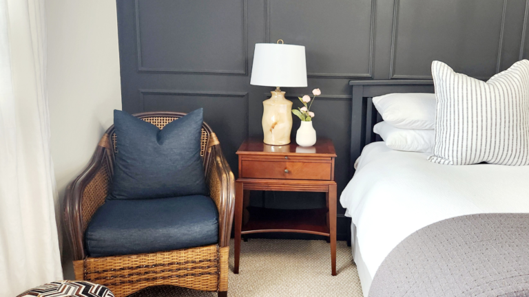
Of course, no room makeover is complete without a good thrift hunt. I scored a pair of mid-century modern drip glaze lamps for a fraction of the cost of new ones.
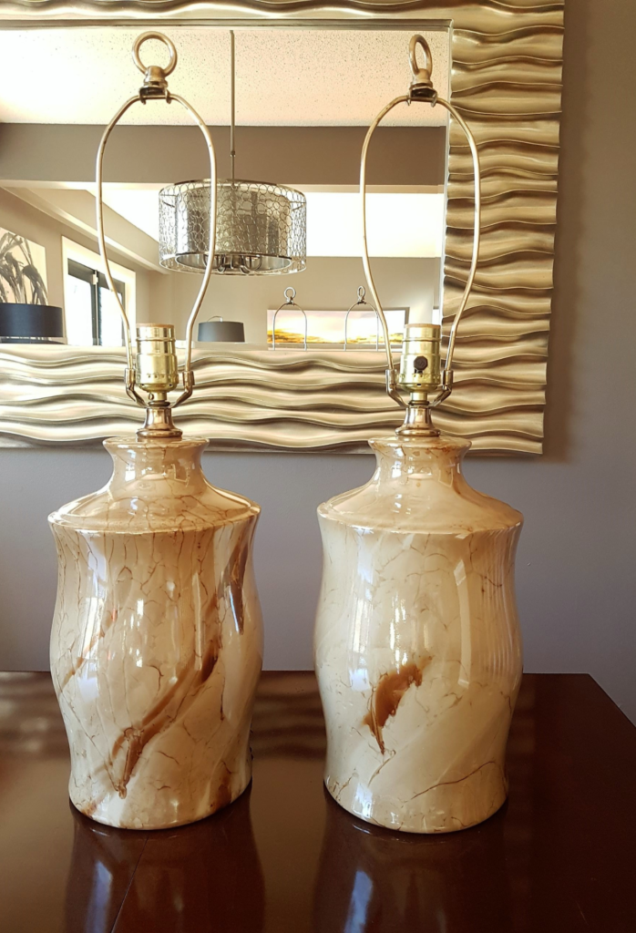
I make it a point to incorporate thrifted finds in all my home makeover projects. By doing so, I tend to discover timeless, unique, one-of-a-kind pieces that enhance my home with a curated look. Moreover, I can save considerable money by purchasing vintage items from thrift stores instead of spending a fortune on new knock-offs.
The Reveal
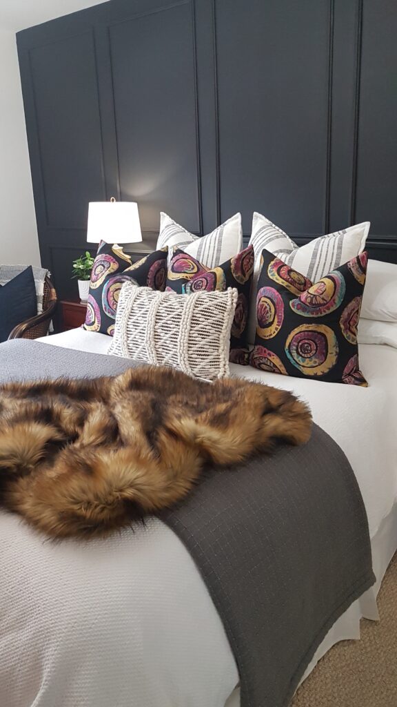
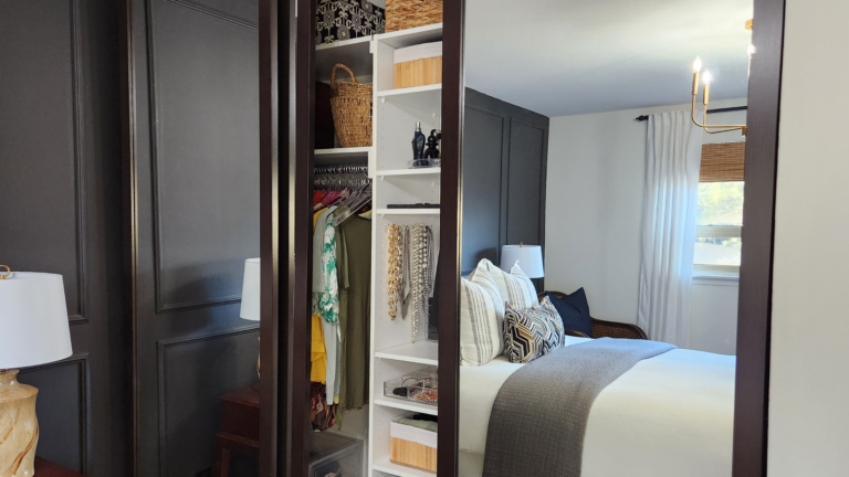
The final result was nothing short of breathtaking.
I couldn’t help but feel a bit out of place in such a bougie space. However, every time I enter the room now, I feel like I’m on vacation in a boutique hotel, and it has significantly improved the quality of my sleep.
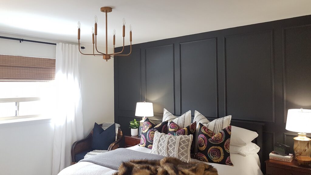
I regret not making the makeover sooner and feel silly for waiting so long. The transformation is so dramatic that it’s almost surreal, and I can’t believe I waited this long to create a space that makes me feel like a deserving and classy individual.


